|
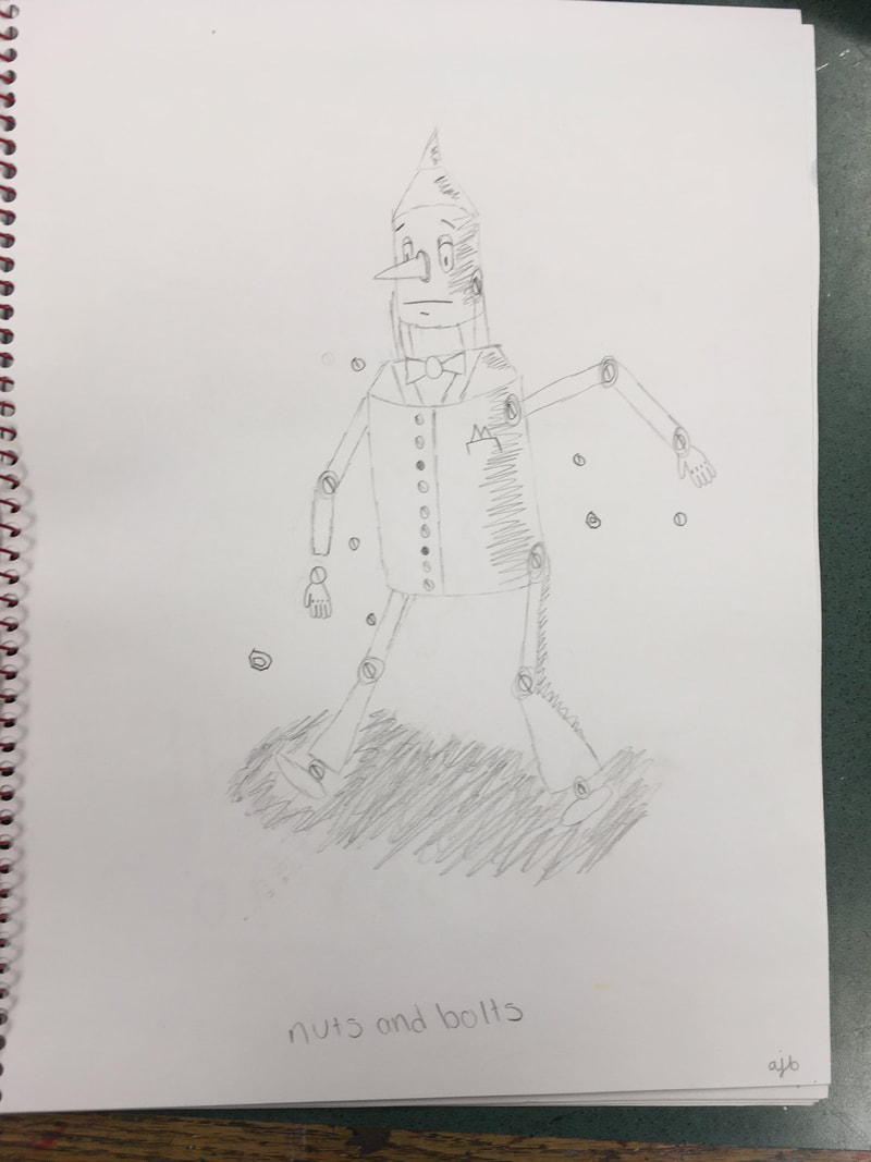
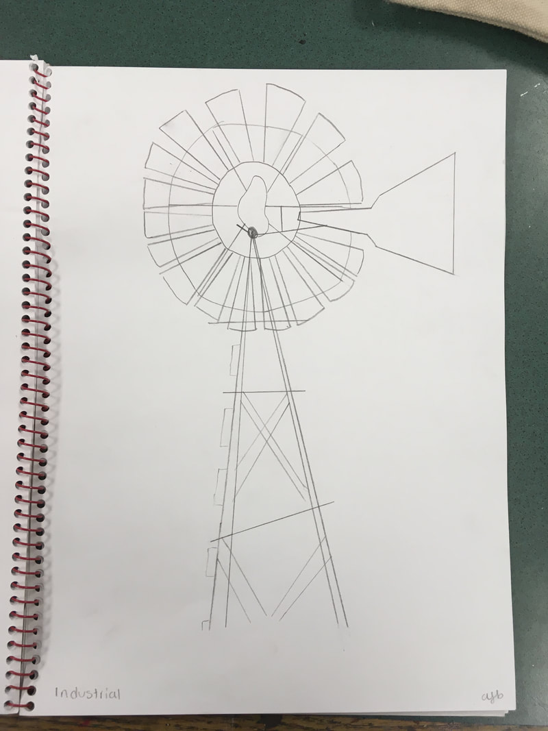
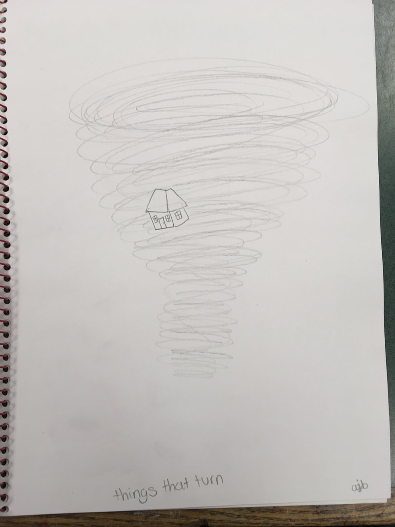
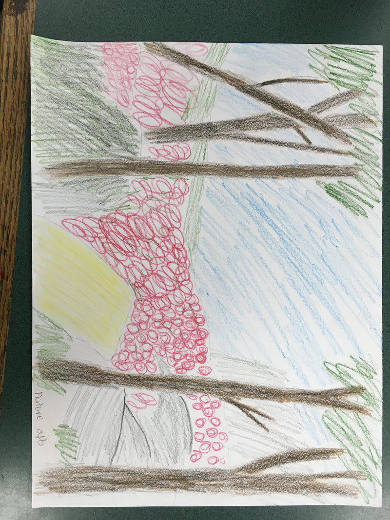
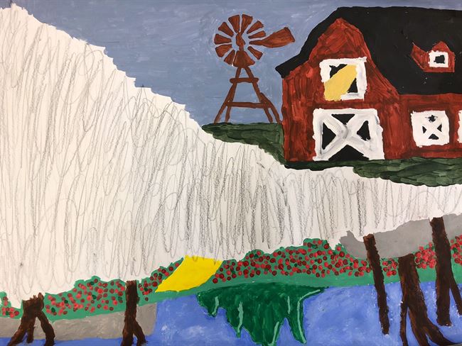
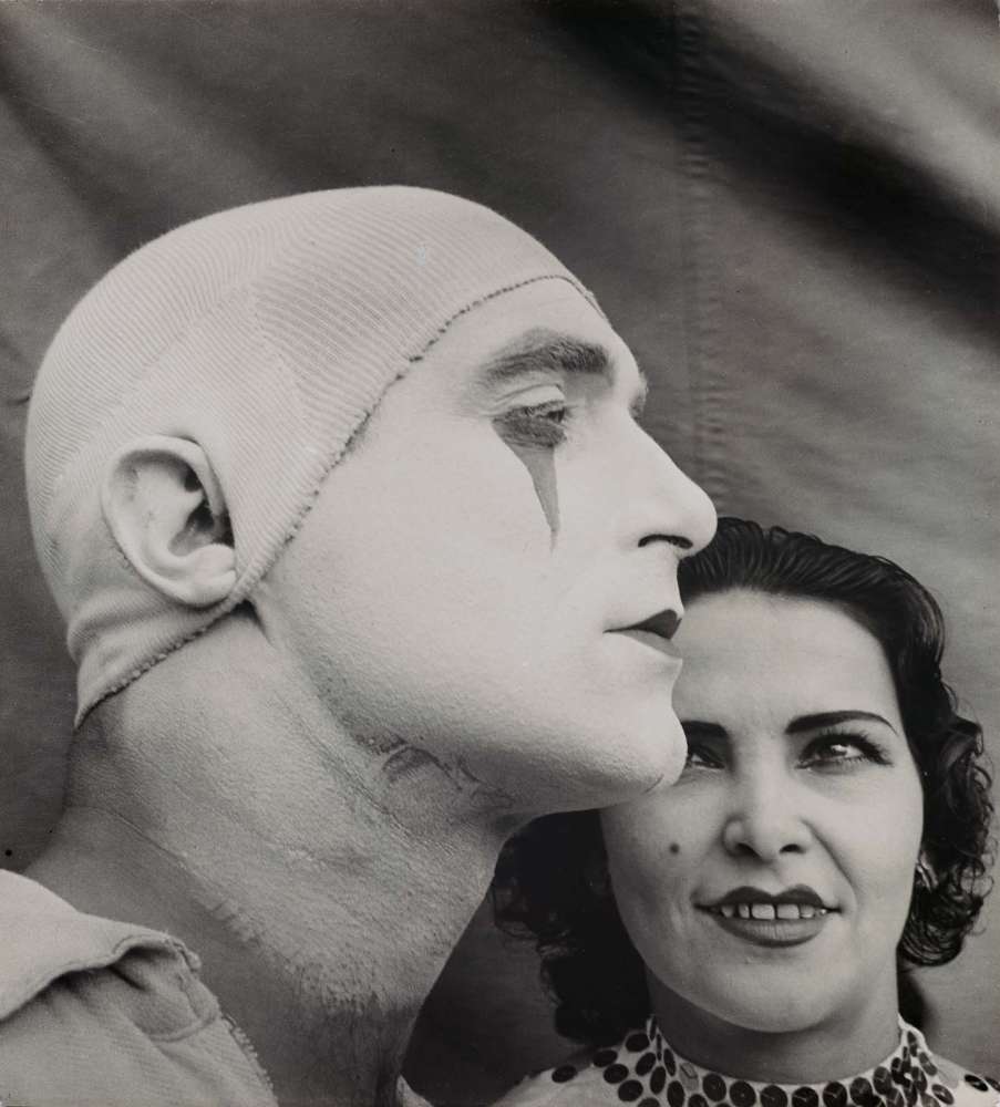
We did a creative brainstorm for a week in which the teacher would give us a prompt and we'd have a day to make and complete and artwork we about how we interpreted that prompt. I've always heard for things like these that young want a general theme as in the end you'd be making a larger project that included all of your prompt ideas. The theme I chose was The Wizard of Oz, this idea first came to me when I made the Tin Man for our first prompt: Nuts and Bolts. The final project I made out of acrylic paint and graphite, I'm not thrilled or happy with it but I feel as though it filled the criteria for the finally project. It was tedious and I wasn't very invested in the project, I hoped my discouragement about it would be met with well encouragement and perhaps it was, but I felt as though I mainly got criticized for it. Overall I'm glad its done but I will probably never unfold the piece of artwork.
0 Comments
I do mostly understand Artistic Behaviors and was able to demonstrate them but on some levels but I also feel like I wasn’t able to explore them fully in some cases. My favorite unit by far was Wayne Thiebaud Sweet Shop with the oil pastels. I enjoyed and had a lot of fun using the oil pastels and they have become one of my favorite mediums, the artwork I made during this unit was perhaps the art I was most proud of. Again for the unit I’ve grown and learned the most from has got to be Wayne Thiebaud Sweet Shop, mainly because through this shop I was able to grow confidence in what I had made and truly feel like I was good at something in this class, which beforehand I had never felt. This unit gave me confidence to try new things and have confidence in my myself and what I create. An aspect of this class that I would change is more creative freedom and acceptance of something new. I felt if I interpreted a prompt differently than wanted it would not be accepted and I would have to do it. These blog posts are something that I would also want to change as I felt having to explain the art kind of ruined the art, but I understand that that will not happen. I would keep the exploration of different mediums to create with, I think everybody deserves the chance to find something they truly have fun with and enjoy using. A piece of artwork I am most proud of but do not have a picture is the Wayne Thiebaud Sweet Shop 3 dessert drawing, it was my first time using the oil pastels and the project came out really well, it was the first project I feel like I got genuine compliments on, that piece of artwork is sadly missing but I can see it in my head and it is definitely what I’m most proud of. I didn’t want to take this course, it was my back-up’s back-up and I admit I wasn’t happy when I found out I had this class. I would have rather been many places during this class but it has grown on me and I got the chance to explore more creative mediums. I got the chance to find out why my friends were so passionate about this craft and perhaps most important for me is that I got the chance to bond and make memories with some of my best friends.
This was my favorite unit, hands down absolutely the art work I'm the most proud of. I've never considered myself much of an artist and didn't really think I was very good at it and I think my previous projects have supported that. But I think I've found its all about what media you use, and I think I've found mine! We did this project based Wayne Thiebaud Sweet Shop, which uses perspective, color, and shading to create beautifully realist sweets! Our actually project was on larger paper and we had to draw the food but I'm not entirely sure where that is so for now I'm just gonna show the singular pieces I did after that project was done. I learned about in this unit and I found something I really like to do, I hope to use Oil Pastels again for future projects and will keep on using them in my own free time.
 For this project we were inspired by a realistic imagery artist, Trompe l'oeil, who uses realistic imagery to create the optical illusion. It mainly uses perspective, color, and shading to create these optical illusion which is what we practiced during this project. I'll admit I wasn't a fan of this, no matter how hard I tried I couldn't get mine to look realist and honestly I didn't know how despite ask for much help and assistance. At one point I just wanted it done and stop restarting over and over, which I think shows. This is probably my least favorite project we done so far in the year and I'm not happy with how it turned, it could have been better but I just don't know how to make it better and honestly after the 4th restart, I just don't care that it looks terrible anymore. This style of drawing is truly amazing and beautifully deceptive, but its not for me.
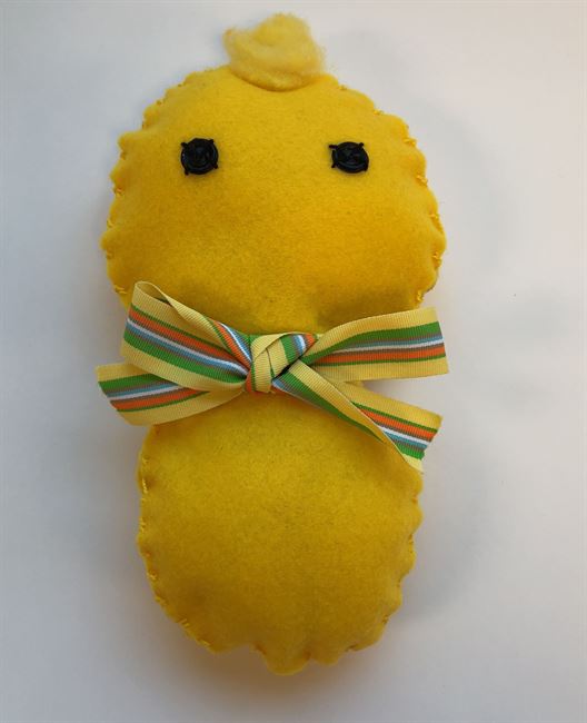
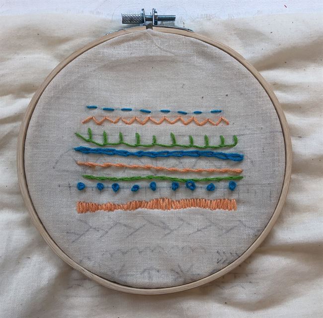
We started off this unit by learning about Faith Ringgold, a famous quilt artist who tells stories through her work. We were then given a sheet showing us all the different kinds of stitches but I personally found videos depicting how to do the stitches to be more helpful. To show that we knew these stitches we were given the project of making our own sampler. We were given our materials which included a embroidery hoop, a needle, and embroidery floss, as well as the fabric which we were to stitch our sampler on. I was able to successfully make my sampler but did fail to follow the pattern I had previously drawn on my fabric, either way I'm still rather happy with how this turned out, although it is a bit messy. Once finished with my sampler I decided to begin a different project that somewhat involved embroidery, the ugly doll. After finding some inspiration i quickly went to work making a template and using it to cut the design out of my fabric. I proceeded to sew on the eyes and then begin stitching the two pieces together using the blanket stitch. Once I was most of the way I stuffed my doll and finished sewing him up. i add on the accessories and I was done! In the end he turned out to be one of if the favorite piece I've ever made. I learned a lot about sewing and embroidery and I had a lot of fun but i did find the beginning when we learned about faith Ringgold to be a bit boring.
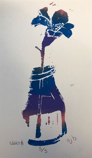
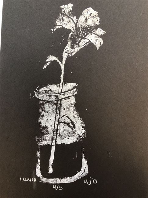
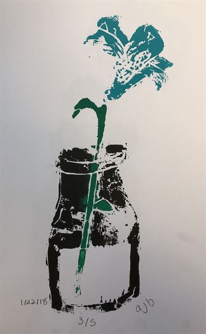
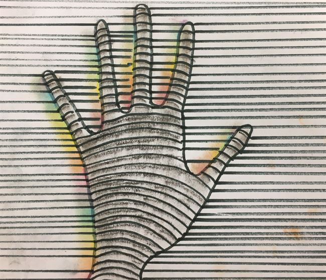
This January in art we worked on Print Making with Linoleum and Ink. We'd go through a process where we'd carve linoleum with a carving tool after having practiced with Ez Carve to make our stamp. But first we'd have to choose our design and draw it on paper, then proceeding to cover the back with graphite and laying the graphite side down on our linoleum block. We'd then trace our design with a pen which then transfers our design onto the linoleum. After carving out our design we'd cover it in ink and place it on a printing block, hence creating the pictures you see above. I did enjoy this unit and learned a lot about the different kinds of inks and the different ways of print making, but I did find that a lot of the creative choices I had made on purpose were quickly rejected. My favorite print out of all of them was discarded and said not to be very good, I very much enjoyed its slightly smudged, abstract look but many disapproved. It disappointed me cause i'd like to believe art is all about creative freedom which I feel this unit lacked.
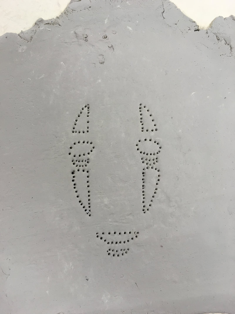
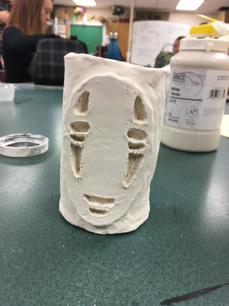
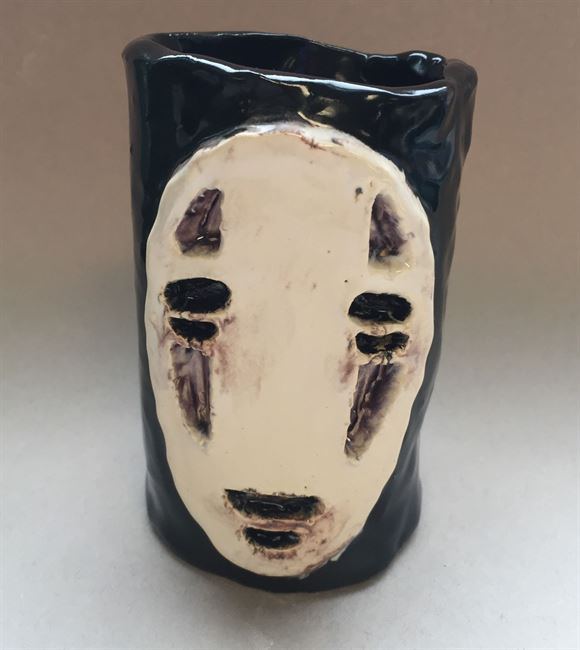
In this unit we worked with clay and focused on its molding and glazing. For this unit we were assigned to make a face mug, and were given a lot of creative freedom. My inspiration was No Face from famous director, Hayao Miyazaki's Spirited Away. The making of the cylinder and base was rather easy, simply molding and cutting the clay into a rectangle and then rolling it and joining the two edges, after that I traced the bottom of the cylinder into another piece of clay which I then cut out to make the bottom. After attaching the piece together with scoring, I then moved on to the actual face of my mug. This part was a little more tricky as free handing wasnt working so I ended up printing out a picture and then tracing it onto clay with tiny holes which marked the way for me to carve out my clay. After cutting out and scoring my face onto the mug I then let it sit and be fired before I moved onto glazing. Using Mulberry, Jet Black, and White I glazed my mug with three layer or each of the colors and quickly learned that White glaze can not cover up the Jet Black. This unit was a good refresher for me as I had completely forgotten to and how to score clay in order to attach thing. I found it very fun although if I were to do it over again I'd find someway to prevent the black and white near the mouth and eyes from mixing and overlapping which made it a tad muddy. Other than this small flaw I do very much like my mug and its probably my favorite work so far.Newbury, Willow Road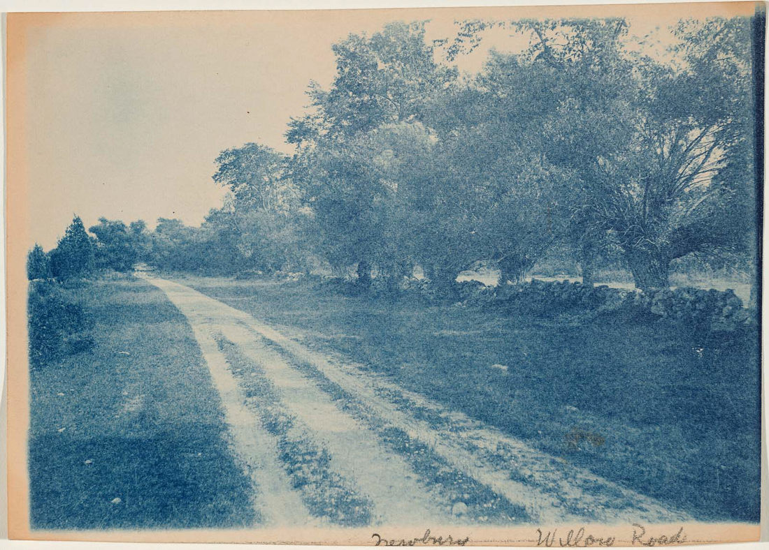 I hear birds chirping and the soft sound of wind as it rustles the trees |
AuthorI'm an 10th grade art student setting up this website cause my teacher says that's what I gotta do. Archives
May 2018
Categories |
 RSS Feed
